Getting Started
Connor H Knight & Faraz Khan
11/08/2021
using_IBRAP.RmdWelcome to IBRAPs Getting Started tutorial page that teaches you how to use some fundamental functions in IBRAP. IBRAP combines analytical components from different packages in R and python to create new pipelines that analyse their datasets better! Please enjoy our tutorial and if you require any help please leave a comment on our GitHub.
Analysing 2994 Bone Marrow Mononuclear Cells (BMMC) from a single sample.
To demonstrate IBRAP we enlisted a sample produced by Oetjen et al. This can be downloaded using this link
Marrow_A is a bone marrow sample from a set of 25. It contains 2994 cells, sequenced using 10x Genomics and aligned using CellRanger. Please download the sample and load it into R using the following command:
Section 1: Cleaning droplet-based datasets
Section 1.1: Applying the functions
Droplet-based datasets present unique confounding effects, including: doublets and ambient RNA contamination. To remove them we have enlisted scrublet and decontX, respectively. Thus far, there is no consensus on the order of application. However, we prefer scrublet followed by decontX.
# We simply supply our generated count matrix to both functions

marrow_A <- perform.scrublet(counts = marrow_A, print.plot = T)
Scrublet functions by simulating multiplets from out datasets (by integrating similar cells); we can see these simulated cells with high doublet scores. For this example, we can see a minimal number of cells in our observed cells with high doublet scores. Cells that are above a certain doublet score threshold are omitted from the dataset.
Now that we have removed these confounding effects from our dataset we can continue with our analysis.
Section 2: Initiating the IBRAP S4 object
Lets start by initiating our IBRAP class object ready for downstream analyses. You can see the structure and a manual for these in our reference section.
# whilst creating the object we begin filtering the cells and genes using min.cells and min.features
marrow_A <- createIBRAPobject(counts = marrow_A,
                              original.project = 'bmmc',
                              min.cells = 3,
                              min.features = 200)
This produces an S4 class object that initially contains sample metadata and a raw method assay contained in object@methods. A couple of important steps happen here: metadata, including: total counts and total genes per cell are stored in object@sample_metadata, and some initial filtering of the count matrix happens. In this case, we removed any genes that are not present in at least 3 cells and removed cells with less than 200 genes, We performed the latter as to remove any droplets that are empty and do not contain true cells.
Section 3: Quality Control
Section 3.1: Metrics
Next, we must assess the quality of our datasets, if you wish to read in-depth about Quality Control (QC) then please refer to this publication. In summary, we use the following metrices to QC our data:
| QC.Metric | Description |
|---|---|
| Mitochondrial Fraction | An abnormally high mitochondrial fraction indicates improper wet lab preparation |
| Total RNA | A difference in count value can affect downstream processes and requires normalising downstream |
| Total Genes | Low gene presence indicates droplets containing no cells whereas, disproportionately high number of genes indicates a droplet containing more than one cell |
As previously mentioned we already generated total count and total genes whilst creating our IBRAP object. However, percentage mitochondrial genes requires a second function since mitochondrial genes have a varying prefix in datasets:
marrow_A <- find_percentage_genes(object = marrow_A, pattern = '^MT-',
                                  assay = 'RAW',
                                  slot = 'counts',
                                  column.name = 'RAW_percent.mt')
Section 3.2: Visualisation
Visualising this information is important for high dimensional data. Thus, we can achieve this in two ways: using violin plots or comparing two metrics with scatter plots.
plot.QC.vln(object = marrow_A,
            metadata.columns = c('RAW_total.features',
                                 'RAW_total.counts',
                                 'RAW_percent.mt'))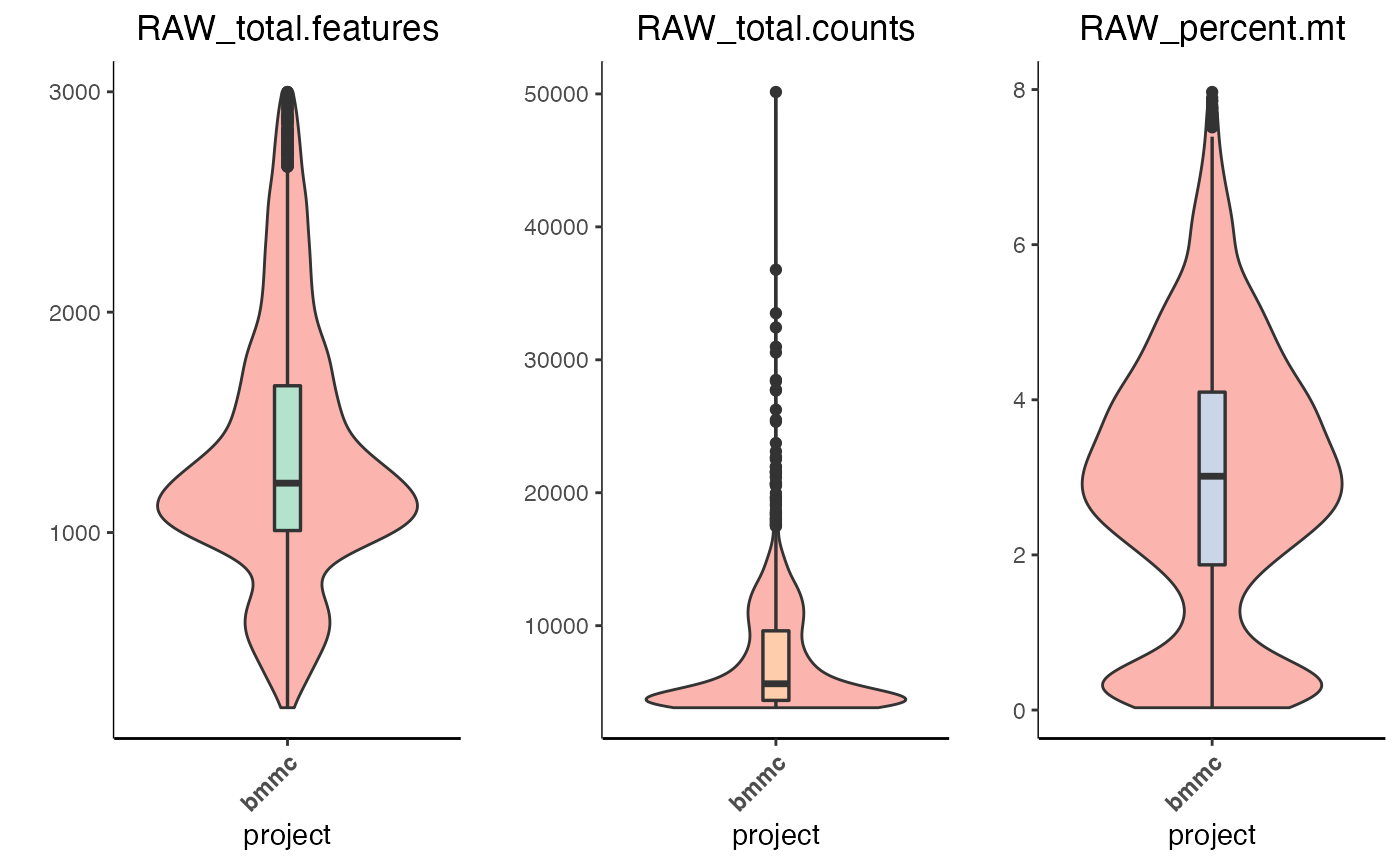
The violin plot is split into its metrics and displays the volume of cells expressing the value on the y-axis.
Scatter plots enable us to observe correlations between metrics, i.e. the higher the amount of features in a cell the higher the number of counts there should be.
plot.QC.scatter(object = marrow_A,
                x = 'RAW_total.counts',
                y = 'RAW_total.features',
                split.by = 'original.project'
                )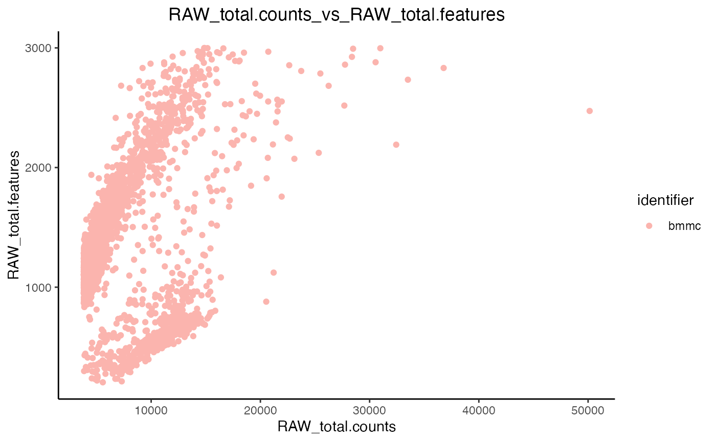
Now that we have eye-balled our data we can proceed to filtration.
Section 3.3: Filtration
We clean our data further by applyng filtration cut-offs. We remove cells with a high number of features since this will remove any doublets that were missed by scrublet (two cells in a droplet will display a disproportionately higher number of features). Then, we remove cells with a certain fraction of mitochondrial counts - we do this to remove cells with damaged cell membrane. The percentage cut-off for mitochondrial genes is set at a case-by-case basis and no single value is applicable to all samples.
marrow_A <- filter_IBRAP(object = marrow_A, RAW_total.features < 3000 & RAW_percent.mt < 8)Section 4: Data Transformation
Section 4.1: Applying The Functions
To accommodate downstream analyses, we must promote a normal distribution and numerical scaling in our data. We included four separate normalisation methods that are applied as such:
marrow_A <- perform.sct(object = marrow_A,
                        vars.to.regress = 'RAW_percent.mt')

marrow_A <- perform.scran(object = marrow_A,
                          vars.to.regress = c('RAW_percent.mt', 'RAW_total.counts'))

marrow_A <- perform.scanpy(object = marrow_A,
                           vars.to.regress = c('RAW_percent.mt', 'RAW_total.counts'))
Now, we can see the available normalisation assays through the following command:
marrow_A@sample_metadata[1:10,]
#>                    original.project RAW_total.counts RAW_total.features
#> AAACCTGCAAGTAATG-1             bmmc            10568                519
#> AAACCTGCAGCGAACA-1             bmmc             6378               1861
#> AAACCTGCATGTCCTC-1             bmmc             4172               1082
#> AAACCTGGTCGACTGC-1             bmmc             6608               1618
#> AAACCTGGTCGCTTCT-1             bmmc             5034               1413
#> AAACCTGTCCCGACTT-1             bmmc             3998               1127
#> AAACGGGAGGGCACTA-1             bmmc             4401               1185
#> AAACGGGCACCTCGGA-1             bmmc             9226               2011
#> AAACGGGCACGTGAGA-1             bmmc             4352               1231
#> AAACGGGCATACGCTA-1             bmmc             4200                998
#>                    RAW_percent.mt SCT_total.counts SCT_total.features
#> AAACCTGCAAGTAATG-1      0.1230129         485.3213                518
#> AAACCTGCAGCGAACA-1      4.7977422        1957.0735               1859
#> AAACCTGCATGTCCTC-1      2.4928092        1138.8269               1082
#> AAACCTGGTCGACTGC-1      5.1906780        1732.1269               1616
#> AAACCTGGTCGCTTCT-1      4.1716329        1498.7047               1411
#> AAACCTGTCCCGACTT-1      4.3521761        1181.2918               1126
#> AAACGGGAGGGCACTA-1      4.0672574        1282.3847               1185
#> AAACGGGCACCTCGGA-1      3.2083243        2011.5219               2006
#> AAACGGGCACGTGAGA-1      4.4117647        1303.8643               1230
#> AAACGGGCATACGCTA-1      2.9047619        1077.4954                996
#>                    SCRAN_total.counts SCRAN_total.features SCANPY_total.counts
#> AAACCTGCAAGTAATG-1           776.7584                  519            521.5231
#> AAACCTGCAGCGAACA-1          2836.5209                 1861           2508.5597
#> AAACCTGCATGTCCTC-1          1612.1623                 1082           1755.9816
#> AAACCTGGTCGACTGC-1          2517.0118                 1618           2174.6400
#> AAACCTGGTCGCTTCT-1          2156.1500                 1413           2143.2267
#> AAACCTGTCCCGACTT-1          1667.6693                 1127           1858.7245
#> AAACGGGAGGGCACTA-1          1822.0787                 1185           1925.6957
#> AAACGGGCACCTCGGA-1          3024.1470                 2011           2192.6501
#> AAACGGGCACGTGAGA-1          1854.9666                 1231           1979.5510
#> AAACGGGCATACGCTA-1          1528.2787                  998           1646.3604
#>                    SCANPY_total.features
#> AAACCTGCAAGTAATG-1                   519
#> AAACCTGCAGCGAACA-1                  1861
#> AAACCTGCATGTCCTC-1                  1082
#> AAACCTGGTCGACTGC-1                  1618
#> AAACCTGGTCGCTTCT-1                  1413
#> AAACCTGTCCCGACTT-1                  1127
#> AAACGGGAGGGCACTA-1                  1185
#> AAACGGGCACCTCGGA-1                  2011
#> AAACGGGCACGTGAGA-1                  1231
#> AAACGGGCATACGCTA-1                   998
Please note, that if your computer has small RAM, then you can change the conserve.memory parameter in sctransform to TRUE, this will make the function slower by more memory efficient.
For these methods, we transformed our raw counts, and regressed some QC metrics from our datasets to not allow them to confound our downstream analyses. There are some notable differences here. For example, SCT automatically regresses RAW_total.counts so we do not need to specify this however, the others you do. These parameters are set as default, any deviation from these is at your own risk since they could produce incorrect results. Nonetheless, feel free to play around and observe the difference.
Section 4.2: How Functions Work Downstream
Each normalisation function produces a new method-assay which contains the results. Any downstream analyses will be stored in these separate compartments, respective to the normalisation method. i.e. object@methods contains all of the method assays. Hereon, function will iterate through the indicated method-assays and any other inputs within the assays. For example, if you supply c(‘SCT’,‘SCRAN’,‘SCANPY’) as assays and c(‘pca_umap’, ‘pca_t-SNE’) as reductions. A function will perform firstly on ‘pca_umap’ in the ‘SCT’ assay, then the ‘pca_t-SNE’ in the ‘SCT’ assay. After these the function will move on to ‘pca_umap’ in the ‘SCRAN’ assay and so on. You will see this as we progress through the tutorial.
Section 4.3: Downstream Pipeline Deviations
Since IBRAP incorporated multiple pipelines, some pipelines begin to vary at this point. For example, Scanpy PCA calculation and neighbourhood graph generation slightly differ. IBRAP accomodates this by identifyig the assay name and automatically applying the correct function. When adding suffixes to any result naming it is important not to include your own underscores.
Section 5: Linear Dimensionaly Reduction
Section 5.1: Principal Component Analysis
Now that our data has been appropriately transformed our data and highly variable genes have been identified we can reduce the number of dimensions using Principal Component Analysis (PCA). Reduction methods summarise as much information from the higher dimensions into lower dimensions as possible. Therefore, these lower dimensions facilitate a faster computing time and require less computational resources.
marrow_A <- perform.pca(object = marrow_A,
                        assay = c('SCT', 'SCRAN', 'SCANPY'),
                        n.pcs = 50)
As you can see, we have requested this function to iterate through all three assays and to save the reduction as pca. The produced principal components (PCs) contain a different explained variance, high variance PCs contain the most information between points and low provide the opposite. Furthermore, low variation PCs create a false closeness between cell points and thus require exclusion from some downstream analyses. A simple way to identify the number of PCs to retain is to plot them in descending order and find the elbow point. The elbow point being the bend in the plot of points. We can observe the amount of variance by plotting an elbow plot using the following function:
plot.variance(object = marrow_A,
              assay = c('SCT','SCRAN','SCANPY'),
              reduction = 'PCA')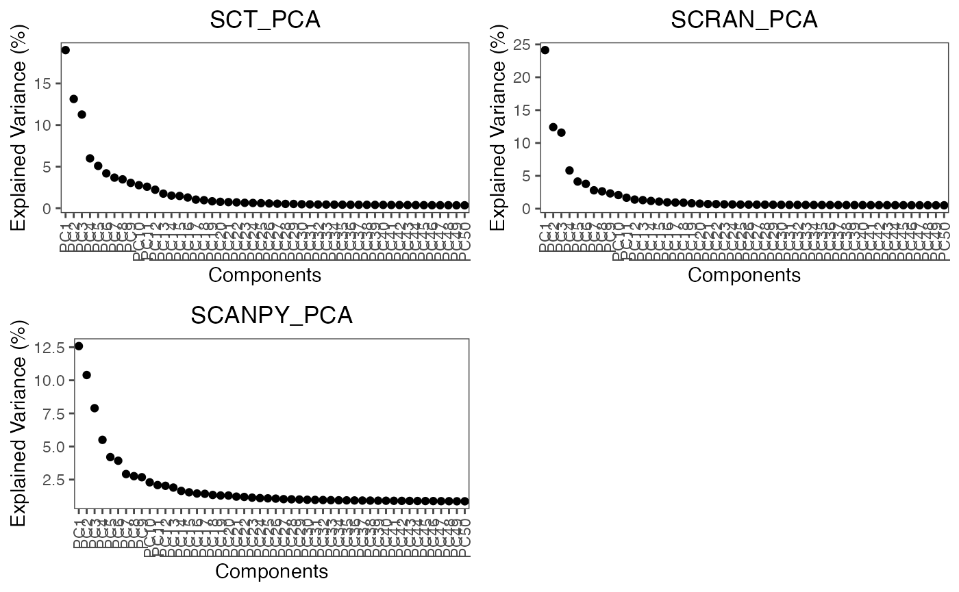
For these assays, the elbow point is around 10-15 PCs.
Section 6: Generating Neighbourhood Graphs & Clustering
Section 6.1: Neighbourhood Graphs
Prior to clustering it is important to ascertain the relationship and closeness of our cells. As a pre-requisite to clustering we are going to produce a k-nearest neghbour graphs. SCT, SCRAN, and SCANPY use one algorithm whilst SCANPY uses its own version. This is produced by applying the following function:
# here we generate the neighbour graph for PCA and produce a diffusion map from the PCA-neighbour graph

marrow_A <- perform.nn(object = marrow_A,
                       assay = c('SCT', 'SCRAN', 'SCANPY'),
                       reduction = c('PCA'), dims.use = list(15))
In this function, we have requested that the function iterate through all three assays, within each assay to use pca and then pca:diffmap using all dimensions (seen as list(0,0)). These results will be stored under assay@neighbours ready for use downstream. ### Section 6.2: Clustering
Finally, using our neighbourhood graph we must cluster close networks together to infer individual cell types. perform.graph.cluster() provides either: - Louvain algorithm (1) - Louvain algorithm with multilevel refinement (2) - Smart Local Moving (SLM) (3) - Leiden (4)
These methods can be adjusted using thre res parameter in the function typically ranging between 0.1-1.5. A higher resolution finds more communities in a sample, whereas a lower value produces the opposite. The default option for this function is to use the following resolutions: c(0.1, 0.2, 0.3, 0.4, 0.5, 0.6, 0.7, 0.8, 0.9, 1, 1.1, 1.2, 1.3, 1.4, 1.5). However, feel free to adjsut this to your requirement.
marrow_A <- perform.graph.cluster(object = marrow_A,
                                  assay = c('SCT', 'SCRAN', 'SCANPY'),
                                  neighbours = c('PCA_NN'),
                                  algorithm = 1)
For this example we clustered all assays and used our neighbourhood graphs generated from PCA and Diffusion maps using the classic louvain algorithm. As mentioned above there are a few graph-based methods. But, we have also inclusing a couple of alternatives that are described in another tutorial
Section 7: Non-linear Reduction
Now we have reduced the dimensionalty of our datasets using non-linear methods and clustered the cells according to their similarity we must visualise these results. However, linear methods such as PCA and diffusion maps are inherently innapropriate for visualisation. Therefore, we must process then using non-linear methods.
IBRAP integrated the ability to perform 3 methods: - UMAP - t-SNE - lvish (a LargeVis adaptation)
For this tutorial we will focus on UMAP.
marrow_A <- perform.umap(object = marrow_A,
                         assay = c('SCT', 'SCRAN', 'SCANPY'),
                         reduction = 'PCA',
                         n.dims = list(15))
Simply, we asked this function to iterate through all assays, and use the first 15 components of the pca reduction.
Now, we have generated a high volume of results, especially clustering results. Therefore, it is beneficial to applying to some benchmarking comparisons.
Section 8: Benchmarking Results
IBRAP contains a benchmarking function that enlists multiple metrices to assess clustering performance. These metrices are only informative however and will be unable to distinguish the best results (that is down to the user to decide).
| QC.Metric | Description |
|---|---|
| Average Silhouette Width (ASW) | This measures how close cells are to their own cluster (cohesion) whilst comparing to other clusters (separation) A higher value is good. |
| Dunn Index | Comapres the ratio of the smallest distance between observations not in the same cluster to the largest intra-cluster distance. A higher value is preferred. |
| Connectivity | This uses a k-nearest neighbour algorithm that determines the connectedness between clusters. A depleted value is prefered. |
Now, lets take a look at the data that we have produced so far:
showObjectContents(marrow_A, c('SCT','SCRAN','SCANPY'))
#> SCT  contains:
#> counts
#> normalised
#> norm.scaled
#> HVGs: TRUE
#> computational_reductions: PCA
#> integration_reductions:
#> visualisation_reductions: PCA_UMAP
#> neighbourhood: PCA_NN
#> cluster_assignments: PCA_NN:LOUVAIN
#> benchmarking_results:
#> (clustering) PCA_NN:LOUVAIN_benchmarked
#>
#> SCRAN  contains:
#> counts
#> normalised
#> norm.scaled
#> HVGs: TRUE
#> computational_reductions: PCA
#> integration_reductions:
#> visualisation_reductions: PCA_UMAP
#> neighbourhood: PCA_NN
#> cluster_assignments: PCA_NN:LOUVAIN
#> benchmarking_results:
#> (clustering) PCA_NN:LOUVAIN_benchmarked
#>
#> SCANPY  contains:
#> counts
#> normalised
#> norm.scaled
#> HVGs: TRUE
#> computational_reductions: PCA
#> integration_reductions:
#> visualisation_reductions: PCA_UMAP
#> neighbourhood: PCA_NN
#> cluster_assignments: PCA_NN:LOUVAIN
#> benchmarking_results:
#> (clustering) PCA_NN:LOUVAIN_benchmarked
#>
#>
To set up the function, supply the names you want to benchmark from cluster_assignments. Next, include the corresponding reductions for them, normally this will be a umap reduction using 1:2 dimensions. For example, if clustering and the umap were calculated using PCA these should be paired, likewise if they were calculated using an integration method we would do the same.
marrow_A <- benchmark.clustering(object = marrow_A,
                                 assay = c('SCT', 'SCRAN', 'SCANPY'),
                                 clustering = c('PCA_NN:LOUVAIN'),
                                 reduction = c('PCA_UMAP'),
                                 n.dims = 2)
We can visualise the comparison within a clustering method dataframe using the following function:
plot.cluster.benchmarking(object = marrow_A, assay = 'SCT',
                          clustering = 'PCA_NN:LOUVAIN_benchmarked')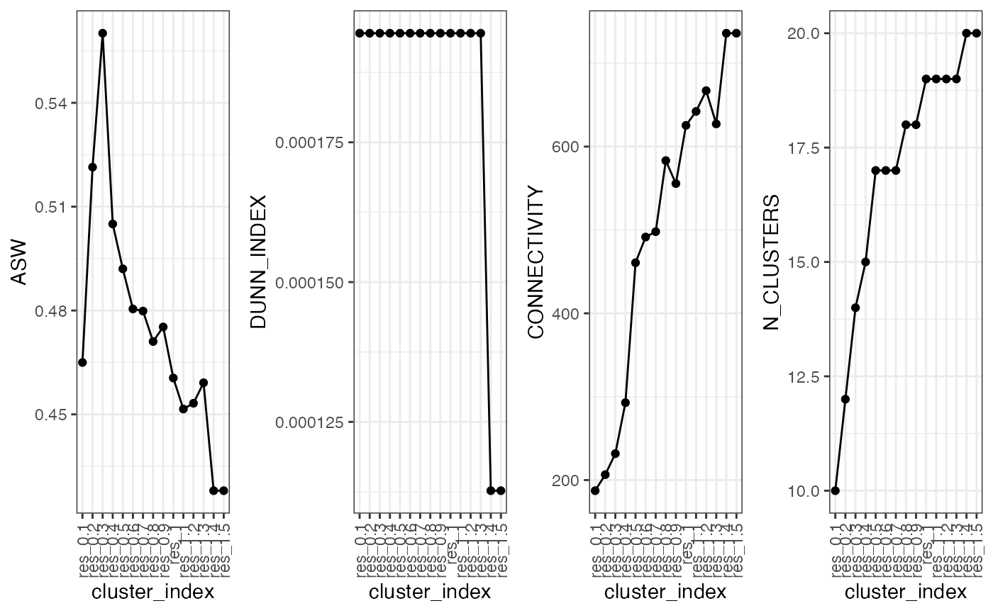
This provides a line graph showing the metrices. As you can see, there is a correlation between the results. However, do not be fooled by the preferred valuei n very low settings, this is likely due to a smaller number of communities being detected at lower resolutions which means that clusters are typically more separated.
Now that we have our results and benchmarking to guide us we can begin to visualise the results.
Section 9: Visualising Clustering Results
Since we have 3 different normalisation method it is beneficial to observe the difference in their produces topology and clustering.
The main challenge with the plotting function in IBRAP is isolating the correct labelling. In general, plotting functions will ask for the assay which is contained within object@methods, the clust.method that is contained withing @cluster_assignments, and the column which would be contained with in that cluster assignment. One thing to note, is that if you wish to access columns that are contained within object@sample_metadata.
plot1 <- plot.reduced.dim(object = marrow_A,
                          reduction = 'PCA_UMAP',
                          assay = 'SCT',
                          clust.method = 'PCA_NN:LOUVAIN',
                          column = 'res_0.8', pt.size = 0.1) +
  ggplot2::ggtitle('SCT') +
  ggplot2::theme(plot.title = ggplot2::element_text(hjust = 0.5))

plot2 <- plot.reduced.dim(object = marrow_A,
                          reduction = 'PCA_UMAP',
                          assay = 'SCRAN',
                          clust.method = 'PCA_NN:LOUVAIN',
                          column = 'res_0.8', pt.size = 0.1) +
  ggplot2::ggtitle('SCRAN') +
  ggplot2::theme(plot.title = ggplot2::element_text(hjust = 0.5))

plot3 <- plot.reduced.dim(object = marrow_A,
                          reduction = 'PCA_UMAP',
                          assay = 'SCANPY',
                          clust.method = 'PCA_NN:LOUVAIN',
                          column = 'res_0.8', pt.size = 0.1) +
  ggplot2::ggtitle('SCANPY') +
  ggplot2::theme(plot.title = ggplot2::element_text(hjust = 0.5))

egg::ggarrange(plots = list(plot1, plot2, plot3), ncol = 3)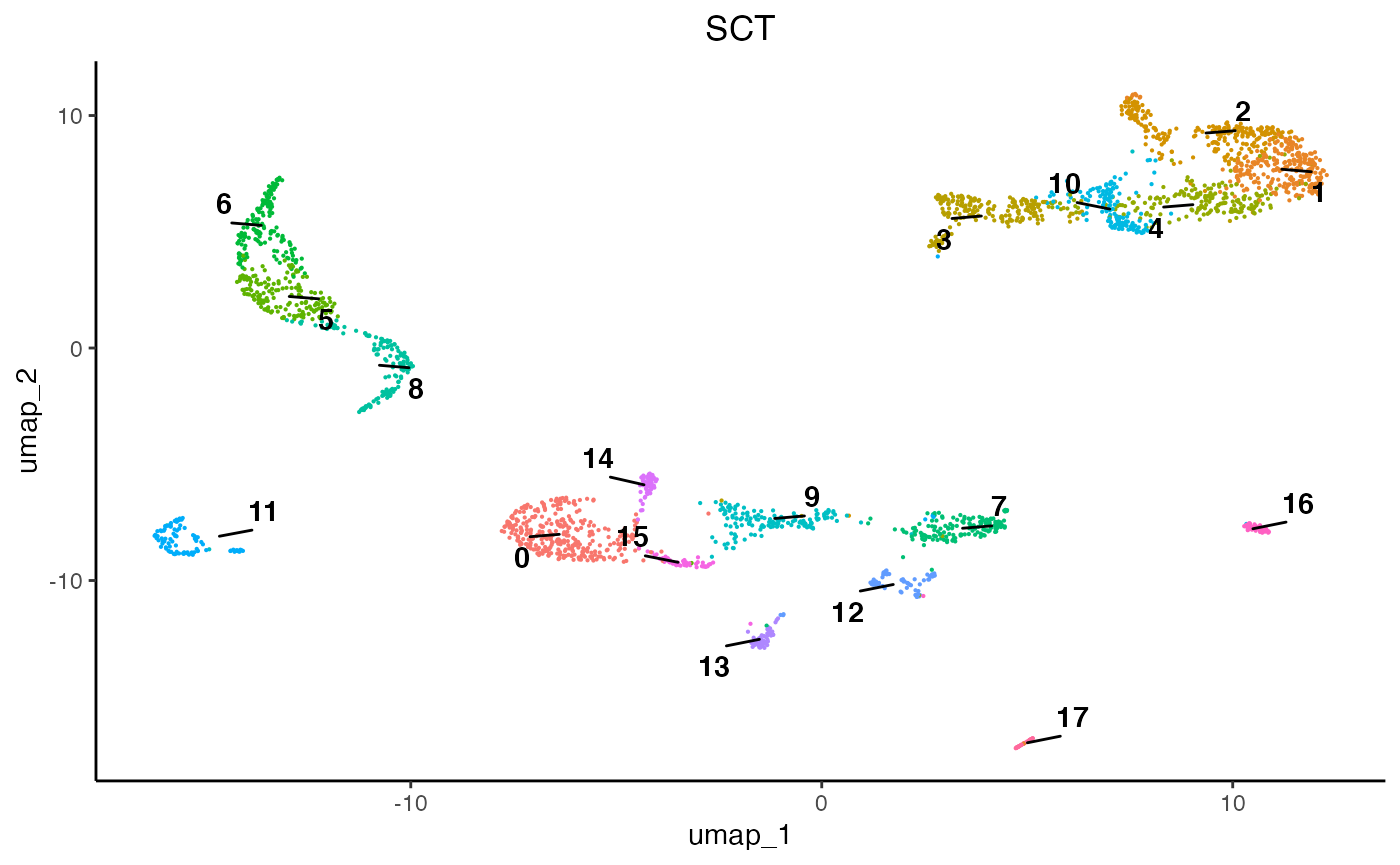
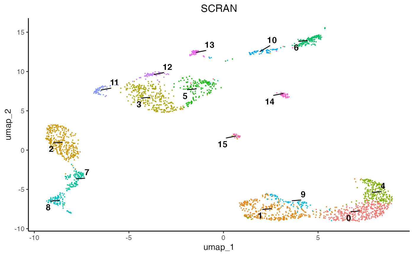
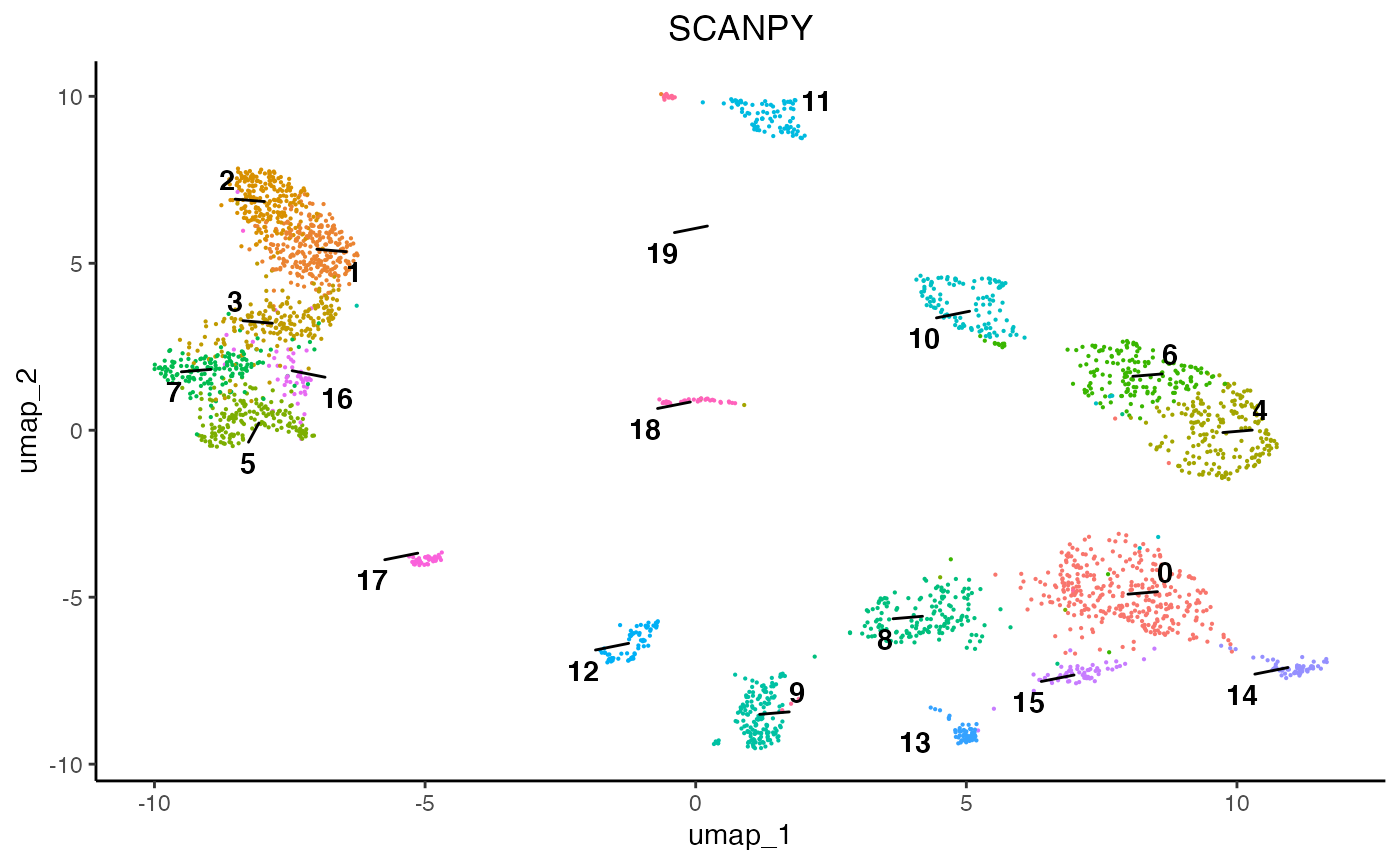
As we can see, each normalisation method changes the final topology of the data. Furthermore, we can see that SCT, SCRAN, and SCANPY produced 19, 15, and 13 communities, respectively. Therefore, it is important to assess all normalisation methods and their subsequent results since they can differ and some perform better than others according to datasets. For this analysis we will proceed using the SCT results.
Section 10: Biological Analysis
To understand the biology driving the clustering we can tackle it in two ways: differential expression analyses or visualisation.
Section 10.1
Differential expression analyses can be performed either 1 cluster compared against all other cells or 1 cluster against 1 other cluster. In this tutorial we will use the 1 v all function.
DE_res <- perform.diffexp.all(object = marrow_A,
                              assay = 'SCT',
                              clust.method = 'PCA_NN:LOUVAIN',
                              column = 'res_0.8')
Now, lets take a look at the results:
DE_res[1:10,]
#>                    p_val avg_log2FC pct.1 pct.2     p_val_adj cluster
#> VCAN        0.000000e+00   2.139740 0.899 0.066  0.000000e+00       0
#> CD14        0.000000e+00   1.797290 0.841 0.038  0.000000e+00       0
#> S100A12    1.590393e-290   3.380330 0.921 0.117 2.387338e-286       0
#> FCN1       1.003886e-288   2.984599 0.994 0.168 1.506934e-284       0
#> CSTA       5.805797e-275   2.440009 0.997 0.160 8.715082e-271       0
#> CTB-61M7.2 2.214807e-271   1.167172 0.640 0.022 3.324647e-267       0
#> MS4A6A     4.944813e-271   1.488988 0.866 0.081 7.422658e-267       0
#> MNDA       2.192499e-267   1.699432 0.884 0.097 3.291160e-263       0
#> CLEC7A     3.196353e-264   1.539125 0.835 0.076 4.798045e-260       0
#> G0S2       2.205006e-260   2.725010 0.869 0.108 3.309934e-256       0
#>                  gene
#> VCAN             VCAN
#> CD14             CD14
#> S100A12       S100A12
#> FCN1             FCN1
#> CSTA             CSTA
#> CTB-61M7.2 CTB-61M7.2
#> MS4A6A         MS4A6A
#> MNDA             MNDA
#> CLEC7A         CLEC7A
#> G0S2             G0S2
These results will produce a table with key columns: the gene names, pct.1 and pct.2 comparing expression values, and their p-value. These columns are key in identifying the strength in the difference in expression and whether the difference is statistically significant. However, when this fails visualisation can help. We have included 4 different methods of visualisation: feature plots, violin plots, dot plots, and heatmaps.
In this case, we can use feature plots:
plot.features(object = marrow_A, assay = 'SCT', reduction = 'PCA_UMAP',
              features = c('JCHAIN','MS4A1','MME','IRF8','HLA-DRA','LYZ',
                           'ELANE','ALAS2','CD34','NKG7','CCR7','IL7R','GZMK'),
              pt_size = 1,
              slot = 'normalised')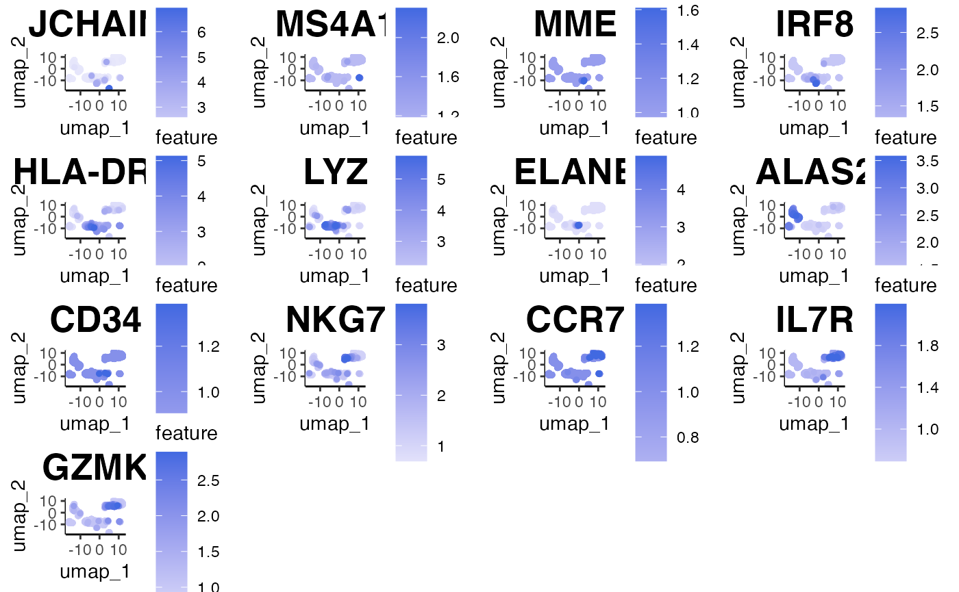
Next, we must indicate which cell type belongs to which clusters. We can fetch results using our FetchResults function.
clusters <- as.character(marrow_A[['SCT']][['PCA_NN:LOUVAIN']][['res_0.8']])

# here we are replacing the clusters with their cell types

clusters[clusters == '18'] = 'plasma'
clusters[clusters == '17'] = 'immature B cells'
clusters[clusters == '11'] = 'pro B cells'
clusters[clusters == '14'] = 'dendritic cells'
clusters[clusters == '15'] = 'dendritic cells'
clusters[clusters == '1'] = 'monocytes/macrophage'
clusters[clusters == '10'] = 'monocytes/macrophage'
clusters[clusters == '6'] = 'neutrophil'
clusters[clusters == '5'] = 'erythrocytes'
clusters[clusters == '8'] = 'erythrocytes'
clusters[clusters == '9'] = 'erythrocytes'
clusters[clusters == '12'] = 'erythrocytes'
clusters[clusters == '16'] = 'erythrocytes'
clusters[clusters == '3'] = 'HSPCs'
clusters[clusters == '4'] = 'NK cells'
clusters[clusters == '0'] = 'CD4+ T cells'
clusters[clusters == '2'] = 'CD8+ naive T cells'
clusters[clusters == '13'] = 'CD8+ naive T cells'
clusters[clusters == '7'] = 'CD8+ cytotoxic T cells'

# and we are going to simply put the cell types into our metadata

marrow_A[['celltypes']] <- clusters

plot.reduced.dim(object = marrow_A,
                 reduction = 'PCA_UMAP',
                 assay = 'SCT',
                 clust.method = 'metadata',
                 column = 'celltypes',
                 pt.size = 0.1)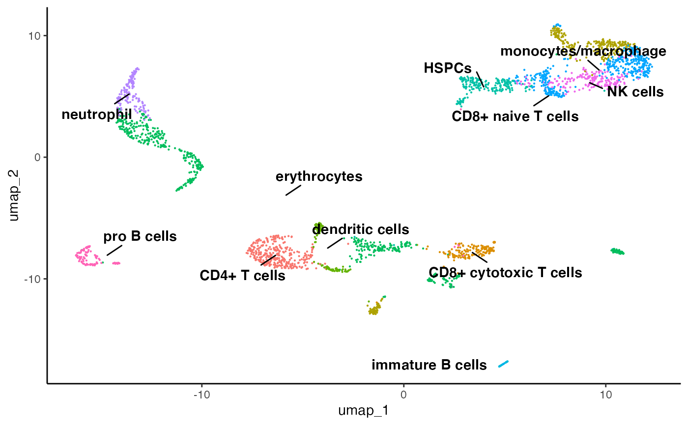
Congratulations for completing your first run through of IBRAP! Thus far, you have installed a great collection of packages for single-cell analytics, produced 3 pipelines, benchmarked them, performed a differential expression, and produced plots. This is just a snippet of what IBRAP is capable of, feel free to explore the available functions and investigate the rest of our tutorial website to further elucidate IBRAP.